

Game Art Analysis — Constance
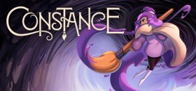
Today, I'm going to write something that is on a bit of a tangent from my usual game articles. Art has always been important to me, so it is something that I pay a lot of attention to when playing. I’m not saying that it has to be totally realistic, but for me, it's more about the feeling of the game and how it uses colour and other techniques to convey this. The title that has caught my attention as of late is the 2D platformer, Constance.

First off, I have to say that this game is stunning; it feels like a piece of art that has come to life, with everything having a hand-drawn look and beautiful lighting effects. Little additions like glowing balls slowly falling across the screen give the game a magical and dream-like feel. Light is also used to highlight objects that you are supposed to interact with, and it shows the exit for this area to lead you to the next screen.

The game uses layers to portray depth. In the background, we see darker-coloured elements that are slightly out of focus — this is depth of field — and the closer we get to the front (camera), the clearer and more defined the objects are. The front layer has rocks, vines, and other dark elements that can block your view, making you feel like you're really there.

Within these layers, there is movement. Trees move around in the blowing wind, while rain is falling in the foreground with lightning flashing in the distance. When stationary, our protagonist, Constance, is breathing, and her hair, which looks like purple paint blobs, is moving, making her feel alive. Though the layers aren’t the only thing done well in the game, they are also great with colour selection.

The blue colour of the stones makes the orange on the trees really pop since they are complementary on the colour wheel; this is also used when we see the large purple flower where Frida, the mysterious character, is hidden. The bloom is violet on the outside of the petal, and for the inside, a pale yellow is used. We will see this colour combination used numerous times throughout the game.

Constance reminds me of games like Hollow Knight and Celeste it gives off a cosy vibe while dealing with a lot of darker themes like mental health and personal psychological struggles. So the art in the game feels like it’s a good contrast to the more serious events in the story; it doesn’t mirror it, as it would be a very dark and gloomy experience that may be draining to play.

If you want to experience a game that will take your breath away because of its handcrafted beauty, Constance is a title that you need to check out! It is one of the most beautiful games I have played in years!

GameGrin are proud to have all their articles researched, written, and edited by real people that care about gaming.




COMMENTS