Tinfoil Thoughts: The Ratatan Logo's Secret
Sometimes you have a thought that seems absolutely nonsensical, often laughed off or forgotten. However, sometimes that same thought lingers, germinates, and evolves until you just can’t shake it. Suddenly, that bit of background perceptiveness is all you can think about, and your walls are starting to look like an avant-garde art installation. This time around, I have my tinfoil thoughts wound up around something relatively benign: a logo.
![]()
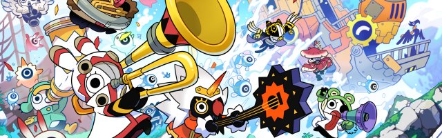
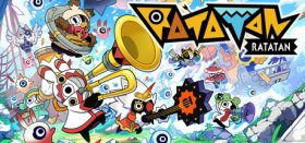
Ratatan, the spiritual successor to the long-dormant Patapon series, is a delightful roguelike with much of the same charm as its predecessor while still maintaining its own identity. Sure, the mechanics are similar, but there’s enough there to separate the two to avoid feeling like just a carbon copy… I just wish someone had told its logo that! See, whenever I look at it, my brain itches.![]()
Maybe it’s the stylised characters or my deep-seated nostalgia for games past, but I cannot look at those bold, angular letters and not read “Patapon”. Maybe it’s just me. After all, the “P” and the second “T” are different enough not to be the same letter, the A’s are literally the same, and the font isn’t even close to Patapon’s… but just look at it!
![]()
I saw it once and have been unable to reorient my brain since. Maybe I’m imagining things, maybe it’s a purposeful nod to its roots; only Ratatan knows for sure. Do you see the same thing as me, am I completely off my rocker, or do you have some tinfoil thoughts of your own? Let us know in the comments!


COMMENTS